Tuesday, November 1, 2016

A few new oil portraits

My mother was quick to point out the mistake I made in having a hard edge in the middle of this face. Indeed, there are no 'hard edges' in portraits, rather soft and perfectly blended ones. At least now this blaring mistake draws my attention away from manifold other mistakes in the region of the mouth. Thank you, mother.

After a brief hiatus, your hero has re-appeared in Budapest! And,  after attending some oil painting workshops at Brody studios, I have produced a few reasonable pieces to hang on the wall. The subjects came from a book of portraits of native Americans. While I have enjoyed the exercise, I am tempted to return to painting in the abstract.

Texture was left out of the shawl on this piece, in order to draw more attention to the face.
I was disappointed with the outcome of this one, though making the necklaces and hair were enjoyable.

Sunday, February 5, 2012

Street Art in Yangon: Rendezvous

To relieve myself of the dregs of sickness from a lasting hangover, I took a bike ride around the block. Not 2 minutes of biking from my hotel I came upon the sound of a DJ and a crowd of people standing around a couple of graffiti murals. Of all things to run across in Yangon, it was a street art exhibit! The show was called Rendezvous and judging by the crowds and the quality of work, there will be a growing contingent of urban artists based in Myanmar and south east Asia.

I am beyond thrilled that I found this show. Driving up and down the streets around Yangon I have seen the smiling vampire tag:  

'Smile Evil Smile', near the Sule pagoda, dowtown Yangon. Photo courtesy of Alicia Stolsmark.

There is also a girl with a gas-mask stencil along Kaba Aye pagoda road and sparse other tags. This show featured work by both of those artists, Cap (from a previous post) and many many more. 

I would have taken more photos, and better photos, but first let me tell you something about Myanmar. Sometimes the power goes out. Sometimes there is not electricity to speak of in the first place. Things are not always, in fact, rarely as one might expect them to be. It is both maddening and endearing. It is unique. I was unfortunate enough to show up at this electricity-impaired opening around dusk, right when it was getting quite hard to see without suitable lights... here's what I was able to come away with:

Cap

'Smile Evil Smile'

SCY Crew

Many thanks to organizer Thu Myat and all of the contributing artists. Hopefully many more shows like this will be possible in the future. 

Saturday, February 4, 2012

Cap


Check out this Swedish artist living in Myanmar. I still haven't quite figured out his technique- typewriter prints through stencils on paper. The effect is shadowy from a distance and intricate up close. I may be partial as the subject matter is largely scenes and themes from my current home, Yangon. The need to locate beauty in the urban mess is also present, and arguably universal in urban art.

http://capism.se/


Sunday, July 31, 2011

off again!

but not before I set this sucker up: miroproject.blogspot.com

Ok, it was a school project, but I do think there's something to be said for noting the eras in which artists work. Especially artists whose work span 8 decades...

My personal favorite


So Mallorca, Spain was beautiful, but the time has come for me to move to Burma/Myanmar to teach. I hear the internet service is not the best, so you may not hear from me for a while. I will do my best to keep up the bloggin' on my visa runs, every 90 days....

Mingalaba!


Friday, June 17, 2011

Rauschenberg at Gemini

Robert Rauscheberg's 1967 Lithograph print "Booster" was the first of several things. It was the largest hand made lithographic print of it's time, requring two lithographic stones, one after another, at the Gemini studio in LA. It was also the first print to juxtapose silk screening with lithography. What started as an experiment ended up as a turning point for both the artist and Gemini.

"Booster" 1967 
Are there any artists left today who are breaking ground on new ways to paint, print, sculpt, or anything? Is there anything left undone? Of course the art world underwent change in the past 50 years, since artists like Rauschenberg were around doing never-before-attempted experiments, but I wonder if there are still materials, techniques, or tools that have yet to be unveiled. I guess it's not all that likely...

It's hard not to find something you like in an exhibit like "Rauschenberg at Gemini" (currently showing at the Philbrook museum in Tulsa). The artist did so much and in a countless variety of materials and tools. There is cardboard, textile, traditional prints, prints on polyurethane sculptures, prints onto clear vinyl curtains and draperies. This is an artist who was not interested in maintaining a consistent theme or style, nor did he seem to care to much about public reception...


What did he care about? The potential within ordinary materials. He didn't believe in confining art to paint, clay and canvas. He embraced a range of ordinary items and incorporated them freely into his work, saying "I've always been more attracted to familiar or ordinary things because I find them a lot more mysterious." And, really, what do we know about the possibilities of rope, cardboard or metals to become art work? Nothing, unless we try...

"You begin with the possibilites of the material." - Robert Rauscheberg

It is so deliciously affirming to have a world-renowned artist like Rauschenberg advocating all of the most valuable things I have learned from Reggio Emilia, the things I try to impart to children when I teach art, and what I believe most deeply when I observe and create art myself. 

Thursday, June 16, 2011

Google Art Project

Have you seen this yet? This is awesome. You've got to try this.

http://www.googleartproject.com/

Monday, June 13, 2011

blank canvases as yet outnumbering quality finished pieces....

I don't quite know what my problem is...some of these canvases are a bit...warped. Taking a good square-on photo has proven tricky. Nevertheless- here is the completed cool-color line study and collage line study. Unfortunately, I've reached another brick wall.  


Wednesday, June 8, 2011

Shadow artist

Larry Kagan creates sculptures out of steel wire that appear abstract and formless. Flip a switch, and the shadows they cast reveal the real purpose and thought behind the formless wire. Using shadow as his medium, Kagan explores ways of encrypting form into inanimate material, and challenges the viewer to transition from seeing an abstract image to seeing something representational quickly and with a mere shift in lighting. It is a challenge to our perceptions and it is a wonder to behold.


Earlier this year, I read about a project on shadows conducted by preschool children in Reggio Emilia. It is such a mystifying subject- what are these dark things that follow us around sometimes? Where do they come from and what are they for? What do they symbolize? The children's ideas are not too far off, actually...

Sunday, June 5, 2011

Back to the grind...

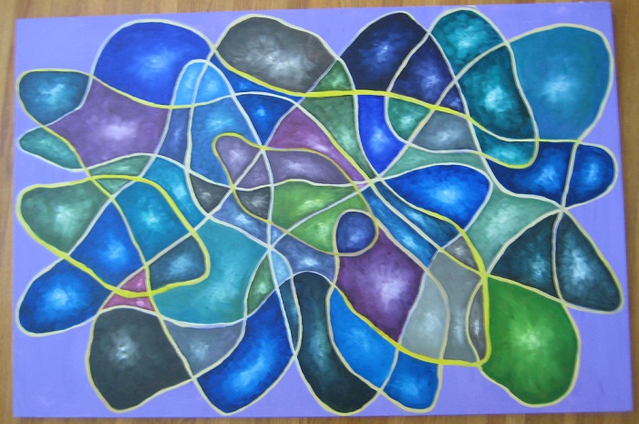
Having "painter's block" for the past few weeks was the result of a number of factors. I hadn't painted in a while, as I transitioned from Portland to Tulsa, but also I've struggled with choosing subject matter. After my course in the winter, I took away many ideas for developing the series I had begun- increasing scale, and going back to the amorphous shapes that I began with in the fall... returning to these was the key to getting back into the grind, however- I could stand to break out of the abstract again. The problem is, I must see the face in order to paint it, and I have find a face that I care to paint....that tends to take time. In the mean time, here is what I've done:

A scaled-up line study with pinks. Though elongated, this does not really take my previous work any further or develop it in any way. I do like it's simplicity and the way the colors work together, but I will not feel at ease without progress. 24X40"

A line study with yarn. 8X10". I am tempted to take away the line and leave the shapes alone but I fear that it will strongly detract from the composition. Fear never got the artist anywhere...

An experiment in creating depth. Thus far, I do not get the sense that the shapes are approaching or escaping the lines any more than were they flat. I'll look at this further when it is complete. Actually, my father asked why I never leave any spaces blank in these compositions....I can't imagine it would appeal to me more than filling it in, but it's another route to consider... 32X48"

Wednesday, June 1, 2011

Patrick Heron

Here I am- home for over a week with around 11 huge canvases at my complete disposal. All of the time and resources I could ask for.....and my mind is totally blank. No ideas. Barely enough motivation to lift a paintbrush and casually contemplate its contours.

So, instead, I research. Ideas have to come from somewhere, after all.

Patrick Heron, a British painter, writer and designer, has a unique style that seems at times like Matisse's paper cut-outs, and at other times like Rothko's colored blocks and lines. He composes his works with color at the forefront of meaning and importance. Using bold, bright colors and large blocks or shapes of each one, he draws the viewer in to his designs like bees to a flower.


Monday, May 30, 2011

Ryan McGinness and the graphic image

Using graphics that you might find anywhere from on a bathroom door to the instructions for putting together an IKEA furniture piece, McGinness composes paintings using screen printed prints from home-made stencils and home-made graphic images.

McGinness is not conservative with his paints, or his color schemes, creating a vibrant array of images, shapes and lines on the canvas, overlapping, interlocking and positively exploding with color. Although they may at first glance appear messy and disjointed, a closer look reveals the deliberation with which McGinness balances form, contrast and hue within each work.

His latest series focuses on the female nude. A provocative and intimate subject, McGinness reduces the powerful images to the bare minimum shapes- a conservative rendering of positive and negative space that leaves the viewer with some work of the imagination. He held a recent exhibit, "Women: The Blacklight Paintings", at Club Madonna in Miami, using live nude models painted to reflect the blacklight as part of the show. An innovate draw if I ever heard one, and a way to appeal to the less "artsy" crowd...


Saturday, May 28, 2011

Bruno Munari

The famous Italian graphic designer and children's book writer was a ubiquitous presence in the bookstores and art shops I visited back in April. I believe he is most famous for his book that uses forks to represent different Italian hand gestures (apparently, there are more than just a few!)


Were it not for the "cigarette?" one, I would buy the book for my 4 year old class next year! I guess it's not like they've never seen cigarettes before...although they would be more familiar with a fork gesture representing stuffing a betel nut into one's cheeks:)

Thursday, May 26, 2011

Zhang Xiaogang

These haunting, somewhat cartoon-like portraits hearken back to official family photographs taken during the Cultural Revolution. The faces that stare back at you from the canvas have a surreal quality, both alien and familiar, officially sanctioned, yet private and vulnerable. Xiaogang achieves such an array of emotions and provocations through his surreal and intimate portraits.

A more detailed take on his inspiration and work can be found here. 

The artist in his studio
'Friend' for the cover of Artzine

'A Big Family'

'Identity Portrait 2'

from Bloodlines: Big Family series