Saturday, January 29, 2011

a few more...

Even though I've received only negative/neutral feedback about the new painting style, I've tried a few more of the same:

12X12" color study

phase 1 of 4X6" line/color study triptych

phase 2....ugh, I shouldn't have filled in those spaces...
I enjoy the process of slowly, methodically placing the lines, trying to put them in a random yet compositionally aesthetic pattern- like fallen string. And then, filling in each space one by one allows the composition to literally take shape- revealing a wholly separate composition. I will finish filling in the spaces on the triptych, and post the results. 

also, was meinen Sie?

Thursday, January 27, 2011

Because I know you're just dying to see what I'm doing...

Well, here you go!


I started with a little Brice Marden-style line study and just sort of filled in the spaces as I saw fit. I like the way the shape/space relationship turned out. 

Wednesday, January 26, 2011

Swampy

When asked how he chooses where to create his art, Swampy replied:

A lot of it is looking for the place where my painting will live a long, peaceful existence. I try to paint places where it won’t ruin someone’s day, but sometimes when the spot is too beautiful, you have to weigh your options.


Teamwurrk


How could it ruin your day?

Check him out in the New York Times this week.

Thursday, January 20, 2011

Flight booked!

I am officially headed to Reggio Emilia in a few months...can't wait to take in some free-range, free-thinking kid art!


Reggio kid doin' his thing


My travel buddy and co-Reggio enthusiast, Ali- doin' her thing


Ciao bella!

Tuesday, January 18, 2011

Mike Perry's got it

Recently I have been trying to draw stacked boxes- maybe in an effort to develop it into some more cubist shapes and designs that I might use in a painting series.


Enter Mike Perry-

wallpaper

what does it say?

poketo wallet


Not along the same lines as cubes and stacked boxes, but a serious hold on geometric design. The wallet is my favorite (strangely)- very Paul Klee (pronounced "Clay").

Saturday, January 15, 2011

Hilarious

I'm only embarrassed that I've been pronouncing "Klee" wrong all this time.

http://www.ted.com/talks/lang/eng/ursus_wehrli_tidies_up_art.html

Thursday, January 13, 2011

What to paint...

So I'm officially signed up for a "painting atelier" class starting next weekend and I'm on the hunt for some inspiration.

Jason Evans and Matthew Cooper, Four Tet album cover for "There is love in you"

Hans Hoffman

???


Color? Shape? Color AND shape? Yes and yes....

Can't wait.

(hat tip to Jacob for identifying the first one....)

Tuesday, January 11, 2011

Venice walls

Here's some images from a wall in Venice, Ca.


I like the way it looks compositionally ( and the walk sign )...kind of like Rauschenburg...

Sunday, January 9, 2011

The street art of San Francisco

It's filled volumes of photo books, and adorns the walls and alley ways of the city.

I love this stuff.

This and the next 7 pics are all one wall on Market street.


The following series was on a corner wall near Haight and Buchanan street 


In a parking lot near the east end of Golden Gate park.


On Haight street


Towering over Market street


The first La Gerbe

We all know this piece:


Henri Matisse's "La Gerbe" is on display at the L.A. county museum of art, and with it, a little bit of it's history. Apparently, the couple, the Brodys, who commissioned Matisse for this work rejected his first idea, named "Apollo". 


So, he came up with "La Gerbe" (The Sheaf) and the couple accepted. It had to be shipped from France to L.A. in 15 pieces, and once the Brodys passed away, the LACMA got a hold of it. 

Here's what "La Gerbe" looked like in the Brody home:  


Read more about the whole debacle here

Saturday, January 8, 2011

Do these guys know each other?

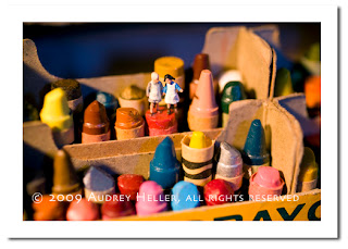
Photographer Audrey Heller and street artist Slinkachu have got a pretty similar thing going on....

So similar, in fact, that I'm not sure if I could tell their stuff apart...the difference, though, is in the setting.


Here's a sample of Heller's photos- Figures with backdrops of every-day objects resulting in playfully ironic images.


From her website: “There is something very familiar about the image of being tiny in a giant environment, and something inspiring, as well as humorous, about seeing such serious and industrious workers and explorers take on the daunting tasks that they face.”


Now,  here's Slinkachu:


Slinkachu sticks to scenes from the city- sometimes gritty sometimes banal- images that we associate with city life, ironically captured in miniature. 


I totally dig his blog, too- I wonder if he has trouble picking out a spot for his little dudes....or if they get stolen...