Thursday, March 24, 2011

Complications

I played around the monochrome painting this morning. I think it's quite a bit more interesting now than it was. I also feel like the red background takes some of the power away from the monochrome design. Ah, well... 


ALSO! I'm gearing up for a 3 week peruse around Italia. Hoping to come back inspired and invigorated. I'm looking forward to summer almost as much as this trip!


Tuesday, March 22, 2011

Meredith Allen's trash photos

Although Meredith Allen is of course not the first artist to make trash her subject, I really like some of the commentary on her photographs below.


" Allen photographs through clear recycling garbage bags she finds on the sidewalk. These seductive images function on various levels. As beautiful abstractions, intriguing glimpses into the glamour of rubbish and the function of photography to recycle our experience towards a heightened appreciation of our daily lives. " - Edward Thorp Gallery


A "heightened appreciation of our daily lives": how much better our lives could be if we were to appreciate art and beauty in the every day. It seems ironic that things like trash and plastics would be at the forefront of this new 'recycled' art movement. Maybe it is becoming a more and more prevalent medium because it is so ubiquitous itself...and free...  

Saturday, March 19, 2011

Monochrome

I love working in simple black and white. Somehow this piece didn't seem to work quite as well as the others. Maybe because I was preoccupied building a rat-trap in the back yard...


I wouldn't call it a successful day.

Thursday, March 17, 2011

You can't say it's not art...

fashion is just wearable art... and what better way to share art with the world than through SHOES!!

Everything I see on the United Nude website is stellar and here is why I think so: 1. Innovative designs 2. A variety of heel-heights, so women who don't wear heels can still enjoy the same styles 3. Reasonable prices. 4. Prices shown in whatever currency you want 5. Super Innovative designs- combining architecture, geometry, curves and comfort.  I want them all.

Here are some of the highlights, if you don't want to get sucked in by following the link=


It's ART!  

Monday, March 14, 2011

Hubert Blanz

This German photographer has some very interesting surreal photographs.  In one series, he depicts an Escher-like amalgamation of building walls into improbable but beautiful designs, in another he uses aerial views of highways to produce a complex tangle of lines and shapes. I think my favorite has to be his series of "maps" made of circuit boards. Very convincing:) Have a look:


If you like any of this, check out his website for more. 


Thursday, March 10, 2011

More complex than the last..

It's amazing to me how changing the nature of the lines just a little changes so much about the piece overall. For this piece I used a slightly smaller brush and made only 3 lines. Although I think the composition might have turned out more interesting (less well balanced) had I stopped after two:


I enjoyed the color process that went into this, and I think that is the strongest element to this piece. Compositionally it's not as interesting to me as the earlier pieces, which are purposefully off center or off balance in some way. 


Tuesday, March 8, 2011

Jan Freuchen and some moss

Although I have reached an impasse with my my last 2 paintings, I am noticing more and more images and artists that connect with what I am trying to do. The images of delicate, intricate and complex tangles of lines are what I find most compelling. Here's some beautiful lines that just fall out of the trees here in Portland:


And here are some lines by Jan Freuchen, Norwegian instillation artist/painter. 

"Ariadne’s Thread"
95 x 80 cm
Oil stick and acrylic paint on wood
2010
The work is an approximate copy of a drawing made by a young girl in an orphanage, post WWII, as captured in the photo by Magnum photographer David Seymour. The drawing was her representation of “home”.


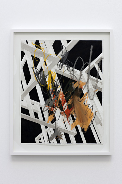
"New Media" (from a series of 12)
60 x 43 cm each
Ink wash and oil pastel on paper
2010


I cannot find much information on the artist in English, but have uncovered this take on his work from a review of his new book "Retreat Center", which is a compilation of works, collages, and writings by the artist: 
Many of the works involve some kind of rigid and unbending structure that is confronted with an expressive gesture; the conventional structures that surround us in our everyday lives encounter a seemingly intuitive, free phenomenon. The works appear as a series of questions posed in a repetitive and almost manic way in an attempt to unite these conflicting idioms. Traditionally, the expressive gesture has been perceived as a liberating reaction to a constricted form. In Freuchen’s works, the 'free line” appears equally constrained and obsessive as the controlled, geometric structures – bridging the brush stroke with the Nike swoosh."

I find Freuchen's "expressive" lines enthralling on their own. Although, the "New Media" series seem to work on a few different levels, coupling the expressive lines with the contrast against thick straight manufactured lines, and color versus black and white. Definitely worth more than a cursory glance.

Sunday, March 6, 2011

Bernard Pras

To have the time and the vision to put together pieces like these with found art is incredible! It just makes me want to dumpster dive and hoard. The world is full of useless trash that can be converted into beautiful works of art! And it's all free!


Also- notice how many of his pieces have an almost imperceptible depth to them- many objects sit a few feet or more back from the rest of the image. The artist must have kept his visual frame on a tripod or some fixed spot or he could have very easily lost track of where things should go...

Check out more of his stuff here: http://www.bernardpras.fr/  There's a great version of Picasso's Guernica.
For those of you following along at home, not much progress was made today. I've made some minimal changes to the previous work, with more to come. In the meantime, I tossed this one together- the same idea as the previous, a convergence of line suggesting shape with the colors suggesting entirely different shapes. I gave this one a more topographical feel, by way of the color relationships, grades and curvature of the lines. I just don't know what to do next. 


Saturday, March 5, 2011

Nina Katchadourian

http://www.ninakatchadourian.com/maps/worldmap.php

Another hidden map-series by well-known artist, Nina Katchadourian. She is known for these compositions of book titles:


 I think her map compositions are less well-known, but fascinating and very innovative. It seems like such a simple change, one of the first things you think about when considering rearranging the world- but Katchadourian makes it visible and accessible. It really is a whole new way of looking at things. Take a look: 


Katchadourian has this to say about her process: 
I made this map in college in response to an assignment, and it marks the beginning of my work with maps. Using a blade, I took apart a paper map, moving pieces over to a large piece of paper which I watercolored the same blue as the ocean in the original map. Gradually, the world was reconfigured. I often reconstructed words using presstype in places where the names of countries had gotten truncated. There were switches based on historical or geopological factors (Western Europe inserted into West Africa); others were based on formal correspondences or quirks of the map itself. Australia and Alaska had the same green border color, for example, and fit perfectly together due to the distortion of scale that occurs towards the poles.
I love this one- what's the Midwest good for anyway? Just kidding, I'm an Oklahoman, after all...


Friday, March 4, 2011

Banksy Spotting!

Banksy has been spotted in LA!

Fortunately for our hero, you can't really see his face at all.


Does any one have a clue as to how he got those letters up there? Very tall ladder?

The evidence suggesting that this photo is of Banksy is only that a.) it is believed to be his work on the tank, and b.) the guy has a camera. Banksy is known to return to his work to photograph it...is it a strong case? meh. Bigfoot sightings have more substantial proof than this. 

Wednesday, March 2, 2011

Jules de Balincourt

I did not until recently really take a closer look at the painting on the cover of Katharine Harmon's "The Map as Art". I've been toying with the idea of doing a map of the U.S. and I finally really took notice of this painting:


I have been, throughout this process of studying and painting maps, struggled to justify creating 'representations' of the world map. I feel like I have to over-emphasize the aesthetic qualities of the boundaries and the shapes, otherwise why wouldn't I just have made it accurate, or to scale? Frankly, besides being tedious, I think it would be a boring image to create. We are all aware of what an accurate projection of a map looks like- I want to take the image and appreciate it for it's visual qualities, rather than always it's symbolic or political qualities. I think De Balincourt achieves that, in that his works are visually stunning- however he does accrue some criticism and question as to their ultimate meaning. 

Megan Ratner praises De Balincourt's colors:  
De Balincourt’s Crayola-by-way-of-Vegas palette (created by taping off sections, spray-painting or stencilling, scraping and scratching) flaunt protean surfaces, highlighting a mastery of colour and shape. He thrives on detail, embedding his compositions with partially obscured figures and objects, the game-board proportions evocative of Lego and electric train sets.
She ends with a bit of a scathing criticism of the artist's stated purpose:
Simply making reference to survival, or showing ‘us’ and ‘them’ as a questionable construct, is hardly startling. Such repeated literalness keeps De Balincourt’s work bobbing well above the sinister depths he seeks to plumb. The question as to whether his ideas will catch up with his sophisticated process remains open.

Robert Mars makes a stab at the artist's contextual reasons for stylizing maps:
 De Balincourt uses American maps reinvented for his own comical New World Order. States are represented by bright planes of color but without any real context. His maps have political intention and commentary. Some of the maps act as graphs for imaginary data of financial and political party affiliation. In the end, his visual sense is perfect. His color palette and compositions add to his story.


Here are some more of his maps: 


I don't know why he flipped China on it's eastern border, but it sure had me confused the first time I looked at it. 


I feel like I've stumbled across someone who has already done what I was setting out to do to a degree. It's a funny feeling. Affirming in one way, disappointing in another.  It might be less of a thrill for me now. De Balincourt's work is simply beautiful; his pallet and shapes. I can use this as an aspiration of sorts.

the latest


Here is what I'm working on now. I'm shifting away from the representational maps and returning to the previous line and shape studies. This time, I want to take it in a different direction. Instead of using 2 or 3 lines throughout the canvas to create the design, I chose to make many small shapes intersecting and overlapping each other- in order to use shapes that resemble the free-form, lumpy and sometimes straight-edged shapes that make up country border lines... I hadn't planned to fill in the shapes, but rather use various patterns to delineate spacial relationships, districts, if you will...i think having background color will add to the interest and variation, though. It adds another layer to the overall idea....literally....^^