Saturday, February 26, 2011

Ugh. I don't like it. There's too much of an op-art feel, with the background the way it is-- and I think it takes away from the design on the continents.


I want to blend all of the rings together and make either a smoother background, or a monochromatic one. Although, I'm not sure if that will be satisfying either....  A black and white version really highlights the areas of high and low contrast...


Thursday, February 24, 2011

Consolidation of two recurring themes, in pink...

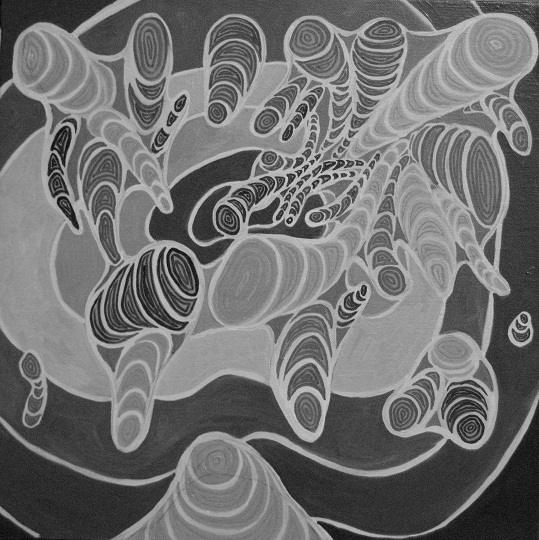
Yes, it's another world map painting, but this time it's special. Back in the fall, I painted these shapes with recurring and expanding outlines. They remind me of the high-elevation areas on topographical maps. The shapes are each separate, though, as if the landforms are emerging, or floating in space.


As I was sketching out some ideas for my next painting, I came upon the idea to create these same outlined/recurring shapes out of the protrusions in a stylized world map. It had to be stylized, too, to fit on that square canvas!


An obvious different here, besides the world map theme, is the fill of the circular and half-circular shapes. Someone mentioned to me that I "always just fill them in" and, in sounding quite bored with my methods, compelled me to try something a little different. I'm pleased with it- although the task now is how to fill the remainder- I want to complement the pink with a bright sea green in somewhat concentric ovals. 


Tuesday, February 22, 2011

Typographic World Map


There are just endless ways you can represent the world map, and each one is so freaking cool! This one reminds me of the city maps with the labeled districts. Sweet. Courtesy of Vlad Studio.

In fact- there are too many great innovative maps on the Vlad Studio site to re-post here, so just visit for yourself! I particularly like the inverse map...though the dried and flooded ones are pretty interesting too. 

Trendy city maps!


Hat-tip to Ali for sharing this site.  I love these maps- Simple, informative, aesthetically appealing... 

I have long been against the use of text in my own art- but I think the tides are changing. It provides such an instant appeal- the business of it, the technical appearance. It's very clean and yet busy. Of course graphic design and painting are capable of completely different looks, but somehow Paula Scher combines the two in her magnificent map: 


I love this piece so much. Talk about busy. I also like that she used an unconventional projection. Was it just in order to put the U.S. in the middle, so that it could bear the brunt of the commentary?  Another interesting facet is what's missing- I'm not sure if I think it was intentional or not to leave out central Asia...it's not always easy to fit everything in proportionally and accurately, but if it doesn't take away from the beauty or from the artist's larger goal, who cares? Regardless...love it.


Here's a close-up so you can see what she's writing on the map. 

Monday, February 21, 2011

Katharine Harmon

Author of a number of books dealing with maps as art; maps depicted in various ways by artists; boundaries and space relationships reconsidered and in representation of any and all relevant things.


Both very worthy reads, and a beautiful collections of work. 


Some very provocative images! Although the bottom one I found on a blog, and I believe was made using mapper, with the variable "extinct species". 


Friday, February 18, 2011

Homage de Zero

Taking a break from the ordinary grind...my roommate John had taken a great black and white photo of our buddy Zero- and the right photo is all I really need.


Here's the completed portrait, with a yellow background

Thursday, February 17, 2011

The background

 Taking a weekend away from this painting made it difficult to see it like I had before. I think darkening to background to the degree I did helps to emphasize the areas of color and contrast. I did not want the shapes to be immediately recognizable, either, lest the painting bear too many expectations as to what it is, rather than how it looks, and what can be seen within it.


Shipping Off!


To Yangon, Myanmar! I'll be teaching at an International School there until May 2013. Exciting!


Thursday, February 10, 2011

Culmination of the afternoon


So I've filled in the spaces, but I don't think I can take credit for much more than that. SUPER distracted by preparing for the job fair this weekend. I leave tomorrow. This little number will just have to wait on me...

In the meantime- here are some old, weird maps for you to chew on over the weekend. Wish me luck!


And yet another way to think about scale, proportion, and spacing- some weird projections of the world map.


This afternoon

Here's what's up next: filling in the blanks of another map.


I'm pretty well done with these two. They may not appear too different from the last pictures, but I removed the white lines from map #1, and went over the ocean in #2 with red, attempting to blur the lines of the continents to create a sense of motion...there might not be as much motion as intended, though. 


Tuesday, February 8, 2011

Another map

Although the shapes are askew from what I was going for, and overall the composition is weak, some things are working for this piece. It won't be a complete abortion, I just wish I could crop it as easily in real life as I can in paint. ^^

Creating these maps from memory has been an interesting exercise in visual perception. Even though my goal is to approximate the shapes and then render them to fit a shape of canvas or composition, being aware of my own inaccuracy in placing countries or islands gets in the way of my awareness of where I want the shapes to be for my goals in this particular piece. My original goal was to cram the world map into a square, with the west coast of North American in the top left corner and Japan in the bottom right...


What thoughts or emotions are provoked by seeing these symbolic shapes arranged or, in this case, projected differently and sort of misshapen or scattered. Does our mind seek to set it straight the way it is supposed to look, or immediately search for the familiar- hone in on inaccuracies? Do we ever consider the natural alignment of the shapes and spaces beautiful in their own right? 


Sunday, February 6, 2011

Barbie doll therapy

Who knew building a miniature city with Barbie doll alter-egos of people in one's real life could be such great therapy!

After being beaten into a brain-damaging coma by five men outside a bar, Mark builds a 1/6th scale World War II-era town in his backyard. Mark populates the town he dubs "Marwencol" with dolls representing his friends and family and creates life-like photographs detailing the town's many relationships and dramas. Playing in the town and photographing the action helps Mark to recover his hand-eye coordination and deal with the psychic wounds of the attack. When Mark and his photographs are discovered, a prestigious New York gallery sets up an art show. Suddenly Mark's homemade therapy is deemed "art", forcing him to choose between the safety of his fantasy life in Marwencol and the real world that he's avoided since the attack.

It's lucky that Mark took such great photos, though, or he might have never been found.

Check out his website and the documentary if you can find it, it's very interesting.


Ugh!

I'm not into it. I think it's too busy. What does this need? Definitely not those white lines, huh....


Saturday, February 5, 2011

Map this

So I guess it's safe to say I'm on a map kick now... I'm trying to deal with my latest draft of the stylized map. Something about it is dissatisfying. I liked the brushed outline better...maybe it was the simplicity of the design, or the variation in the line itself. Anywho...


It's not over yet. In the meantime, here's some rubber cut images of the same. My first attempt, of course, turned out backwards. Hilarious though it is, I haven't included it here. 


Some variation is definitely in order. But since I have to return the copy of Plane Image: A Brice Marden Retrospective tomorrow, I'll spend my Saturday evening reading that. In the meantime, enjoy this map of the world using flags to delineate countries:


Tuesday, February 1, 2011

progress as promised

Here is the progress being made. I completed the 4X6 triptych and I rather like the brightness it ended up with. As much as I dislike the cheap feel of canvas panel, they really absorb the acrylics and reflect light from the oils quite readily.

final 4X6" line study triptych
I showed up to class with only the images of my week's work on my camera and a big blank canvas, thinking I could just do what I've been doing and that would work. The question of intention, purpose and meaning have been brought up to me before, and, frustratingly, I am never quite sure how to answer besides that I enjoy the interplay between the lines and shapes, the colors and intersections. There is more to it than that, and I am motivated to uncover the best way to communicate it. When Stephen began reading from "Art and Fear" again and addressing issues of viewers' reception of work, I decided I must bring more intention into my work. 

world map doodle on wood panel 4X5"
phase one of stylized world map project

phase 2
 I find maps very visually and intellectually compelling. The way we perceive space on a 2-D representation of  real places informs our sense of geographical awareness. Our own space/time continuum is relative to that of every other living and non-living thing around us. To make representations and compressed images of our surroundings reveals how we perceive our role in the order of nature, and of life.